
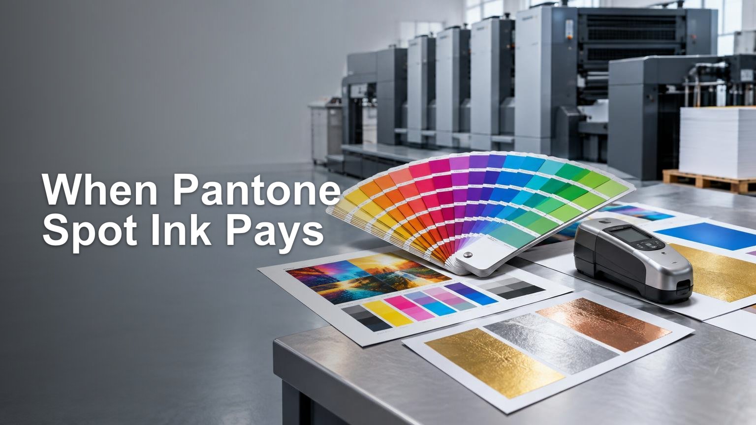
TLDR: Use CMYK for most photographs, multicolor artwork, short-run digital jobs, and projects where a reasonable visual match is acceptable. Pay for a separately printed spot color when a difficult or highly controlled brand color matters enough to justify extra setup, or when the design requires a metallic, fluorescent, or similarly specialized ink effect. Do not assume that specifying a Pantone number guarantees an identical result. Define whether the color will be printed as a real spot ink or simulated, approve it on the intended stock, and agree with the printer on what constitutes an acceptable match.
The useful question in Pantone vs CMYK printing is not which system is “better.” It is what the printed piece needs to accomplish and how much color variation the business can tolerate. A corporate identity used across packaging, signs, stationery, and retail displays presents a different risk from a one-time brochure full of photographs.
My default is CMYK unless the job gives me a reason to add a spot ink. That reason might be a brand color that falls outside the practical CMYK gamut, a very clean single-color design, or a specialty effect that process inks cannot create. “We always use Pantone” is not a production specification. It is the start of a conversation.
What CMYK, spot color, and Pantone actually mean
CMYK is process-color printing. Cyan, magenta, yellow, and black are printed in controlled combinations, usually as screened dots, to create a broad range of colors. Spot-color printing instead uses a separately formulated ink printed from its own separation. A job can use only spot inks, only CMYK, or CMYK plus one or more spot colors.
Pantone is a color communication system, not one universal printing method. Depending on the library and workflow, a Pantone reference may identify a solid ink target, a process-color reference, or a color that will be simulated by a digital or extended-gamut device. A buyer therefore needs to specify both the intended Pantone reference and how the printer is expected to produce it.
| Production choice | What physically produces the color | Usually makes sense when |
|---|---|---|
| CMYK process | Combinations of cyan, magenta, yellow, and black | The job contains photographs or many colors, or an acceptable CMYK result has been demonstrated |
| True spot color | A separately formulated ink printed as its own separation | One or a few colors require tighter control, greater cleanliness, or a special ink property |
| Digital or extended-gamut simulation | A device reproduces the target with its available process inks or toners | Short runs and variable work need a practical match rather than a dedicated mixed ink |
| CMYK plus a spot color | Process color handles imagery while a separate ink handles a critical color | A multicolor design contains one brand color or effect that process printing cannot handle acceptably |
The distinction should appear on the quotation. If a supplier says “Pantone matched,” ask whether that means a separately mixed and loaded ink, a CMYK conversion, or a simulation using a wider ink set. Those approaches can all be useful, but they are not interchangeable.
A Pantone number is a target, not an unconditional guarantee
A Pantone identifier gives the designer, buyer, ink supplier, and printer a shared reference. It does not make every substrate and printing process produce an identical visual result. The ink-and-paper combination affects the physical appearance, and an on-screen swatch or office-printer output does not define how a spot ink will look on press.
Coated and uncoated papers interact with ink differently. The surface can affect absorption, gloss, apparent saturation, and visual depth. Films, colored stocks, laminates, and coatings introduce more variables. If the final piece will be laminated, for example, approving an unlaminated sheet may not answer the question the buyer actually cares about.
Pantone suffixes and libraries matter because they identify different references or intended conditions. I would not accept “use Pantone blue” as a complete instruction. The job specification should name the full reference, including the applicable library and suffix, then state the substrate and production method.
For ordinary work, visual approval under a consistent viewing condition may be enough. For brand-critical production, the buyer and printer may need an approved physical standard, a contract proof or press sample, defined measurement conditions, and an agreed tolerance. That is where print process control becomes more useful than arguing over whether a monitor looked slightly greener on Tuesday.
Why a CMYK conversion can look different
CMYK cannot reproduce every visible or specified color. Some solid spot colors are cleaner, brighter, or more saturated than their closest four-color simulations. Pantone’s Color Bridge products are intended to place a solid Pantone reference beside a closest CMYK simulation so the difference can be evaluated before production.
Even an in-gamut conversion depends on the output condition. The press, ink or toner set, paper, screening, calibration, and color profile all affect the result. ICC profiles describe an intended relationship between color values and an output condition, supporting more predictable conversion. They do not give a printer colors its ink-and-substrate combination cannot physically produce. The International Color Consortium’s introduction to ICC profiles is a useful explanation of what profiles communicate and why output conditions matter.
This is also why a single set of CMYK percentages is not a universal definition of a brand color. Those values are device instructions. The appearance they produce can change between a coated offset sheet, an uncoated digital stock, a corrugated liner, and a vinyl graphic.
Before paying for a spot ink, ask the printer to produce the intended CMYK or digital simulation on the real stock. If the difference is not commercially meaningful, CMYK is probably good enough. If the simulated color weakens recognition, clashes with adjacent artwork, or fails an established approval target, the spot ink has a job to do.
Metallic, fluorescent, and neon colors change the decision
Matching a hue is not the same as reproducing an optical effect. Standard CMYK may approximate the general color family of a metallic or fluorescent reference, but it does not reproduce metallic reflectance or fluorescent behavior.
If the design depends on shimmer, unusually high visual intensity, or another ink property, request the actual specialty production method and a representative sample. A metallic-looking gradient built from CMYK can suggest metal in the artwork, much as a photograph of chrome suggests chrome. It does not turn ordinary process ink into reflective metal.
Specialty production also requires construction-level thinking. The effect can change with the substrate, ink coverage, underprint, coating, and viewing angle. Clear, dark, or colored materials may require an opaque foundation; the same practical problem appears in white-ink printing, where ink order, registration, and the material all affect the result.
Does a spot color always cost more?
No universal premium or run-length crossover exists. A separately mixed ink can add ink preparation, a press unit, wash-up, makeready, spoilage, and proofing requirements. On the other hand, a limited-color job produced with one or two spot inks may be operationally sensible and need not be compared with a full CMYK job as though the two were identical. Pantone likewise notes that individually prepared spot inks can add cost while remaining well suited to limited-color work.
Quantity is only one variable. The calculation can change with press format, number of colors, whether CMYK is already needed, substrate availability, ink minimums, drying or curing, finishing, scheduling, and repeat-order expectations. The cheapest press sheet is not necessarily the cheapest delivered job if it creates extra handling or a higher reprint risk.
I would request equivalent written quotations for the plausible constructions:
- CMYK on the specified stock, with the intended coating or laminate included.
- CMYK plus one separately printed spot color.
- A spot-only construction if the design uses few colors and no process imagery.
- A digital or extended-gamut simulation on the same or commercially equivalent substrate.
- Any specialty ink as a separately identified production element, not merely a color name.
Compare setup, proofing, production quantity, overs, finishing, freight, turnaround, and repeat-run requirements—not just the unit price. The same principle applies to the broader digital-versus-offset cost decision: there is no honest crossover without a defined job.
Digital simulation and extended gamut can be excellent compromises
Many digital devices reproduce a Pantone target using the colorants available in the machine rather than loading a separately mixed Pantone ink. That is a simulation, even if the ordering interface lets the designer choose a named spot-color swatch. The swatch can preserve the design intent and drive color management, but it does not prove that a physical spot ink will be used.
Extended-gamut printing adds process colors—commonly orange, green, and violet—to CMYK to increase the printable range. It can bring more named colors into practical reach and can reduce dependence on individually mixed inks in suitable standardized workflows. It remains a process-color approach, not a universal replacement for every dedicated spot or specialty ink.
The advantage is especially attractive for short runs, versioned packaging, and jobs containing several brand colors. The limitation is device specificity. A successful match on one press, profile, and stock does not establish that another combination will produce the same result.
For a critical digital job, ask for a production-device proof on the intended substrate. Dependable proofing of spot colors requires more than assigning a name in design software; the output condition and spot-color characterization have to be communicated appropriately. If you are still selecting the production route, broader commercial printing options can help frame which processes are available before you lock the artwork.
When CMYK is good enough
CMYK is usually the practical choice when the design is dominated by photographs, illustrations, gradients, or many colors; when the run is short or frequently revised; and when a tested process conversion meets the business need. It is also sensible when consistency within the selected production workflow matters more than matching a separate physical reference used elsewhere.
A spot ink becomes easier to justify when one color is central to recognition, the closest process simulation is visibly inadequate, or the ink must provide a property that CMYK lacks. CMYK plus one spot color is often a rational construction for packaging, brochures, folders, and brand collateral containing both photography and one difficult corporate color.
Do not pay for spot color merely because the design manual contains a Pantone number. First find out whether the approved CMYK or extended-gamut result is acceptable on the actual substrate. Conversely, do not remove a spot color solely to save one line item if a failed match would trigger rejected inventory, delayed launches, or a reprint. Color risk belongs in the cost calculation.
The print-buyer checklist
Before approving a Pantone vs CMYK printing specification, give the printer enough information to quote and control the same job you think you are buying.
- Provide the complete Pantone reference, including its library and suffix where applicable.
- State whether you require a separately printed spot ink or will consider a CMYK, digital, or extended-gamut simulation.
- Identify the exact stock, color, surface, and relevant coating or laminate.
- Confirm the press or production process used for both the proof and final run.
- Ask what proof is appropriate: a process proof, production-device proof, drawdown, ink sample, or press approval.
- Define whether approval is visual, measured, or both, and agree on any required tolerance before production.
- Identify metallic, fluorescent, opaque, or other specialty behavior explicitly; do not describe it only as a hue.
- Ensure quotations use the same size, quantity, color construction, stock, finishing, packing, freight basis, and turnaround definition.
- Keep an approved physical sample when repeat orders need to align with earlier production.
- Use a documented receiving check, such as a practical print quality checklist, to compare the delivered job with the approved target.
Choose according to color risk, not terminology
For most multicolor commercial work, I would begin with CMYK and evaluate a proof on the intended stock. I would add a true spot ink when the process simulation fails a meaningful brand or design requirement, or when the required effect is physically outside ordinary CMYK production.
The crucial distinction is not Pantone versus CMYK as competing labels. It is a defined physical target versus an assumed one. Tell the printer which color reference you mean, how the color is expected to be produced, what material will receive it, and how approval will work. That turns “make it match” from a hopeful email into a production specification.
References
- PANTONE® USA | Spot vs. Process Color
- Spot vs Process Colors | Creative Cloud
- PANTONE® USA | Pantone Color Systems for Graphic Design
- PANTONE® USA | What Are Your Color Spaces?
- Introduction to the ICC profile format — International Color Consortium
- FAQ: Audience questions from
- global.pantone.com
- Proofing and printing documents that include spot inks — International Color Consortium